Stop using those annoying spacer GIFs or using weird CSS tricks, and try out this awesome technique for creating wicked cool online bar graphs in 5 minutes or less:
INGREDIENTS:
Microsoft Excel
A pinch of math
Table Tango (you’re going to love this if you haven’t seen it yet)
Cellpadding and spacing to taste
INSTRUCTIONS:
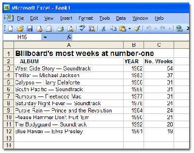
Take the numerical information you want to turn into a bar graph and paste it into Microsoft Excel. As an example, I’m using a snippet of Billboard’s top albums, which I swiped from Wikipedia:

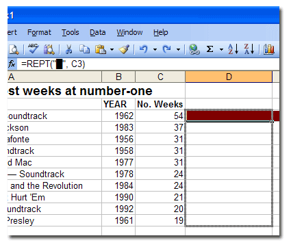
Now, in the cell NEXT to the first numeral (in this example, cell D3), enter this formula in Excel’s formula bar:
This little formula essentially says “duplicate the â–ˆ character as many times as the number in this cell.” In this case, I’m using a special HTML character that will simulate a clean bar. In place of the “â–ˆ” you can use any symbol you like. An uppercase “I” works well also. Make it whatever color you like using the text color tool.
Now, place your cursor on the bottom right-side corner of the cell with your formula in it. The blocky-looking cursor should become a thin, black cross (cursor not visible in the screenshot). Click and drag all the way straight down to your last item:

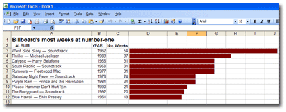
Release it, and voila! Instamatic bar graph! Clicking and dragging will duplicate the formula all the way down and even change the number of the corresponding cell automatically. Take that, you evil pivot tables!

If your bar graphs are too long, then change the formula by dividing the cell (by 3 in the following example):
You can divide by whatever number will make the graphs manageable in size.
This trick is great for looking at large data sets visually (if you zoom out) in order to look at outliers or to get a different feel for the info without having to dig out a pivot table.
***************
Now the online part:
Copy all the cells containing information and paste them into the ridiculously cool window at Table Tango, a utility created by former Orlando Sentinel staffer Ray Villalobos. Here’s the full URL: http://www.raybo.org/powertools/tabletango/.
Set your cellspacing, cellpadding to your liking. Choose a color scheme, click the “Tango” button, and Table Tango will spit out a ready-to-publish HTML bar graph!
| Billboard’s most weeks at number-one | |||
| Album/Artist | Year | No. Weeks | |
| West Side Story — Soundtrack | 1962 | 54 | ██████████████████ |
| Thriller — Michael Jackson | 1983 | 37 | ████████████ |
| Calypso — Harry Belafonte | 1956 | 31 | ██████████ |
| South Pacific — Soundtrack | 1958 | 31 | ██████████ |
| Rumours — Fleetwood Mac | 1977 | 31 | ██████████ |
| Saturday Night Fever — Soundtrack | 1978 | 24 | ████████ |
| Purple Rain — Prince and the Revolution | 1984 | 24 | ████████ |
| Please Hammer Don’t Hurt ‘Em | 1990 | 21 | ███████ |
| The Bodyguard — Soundtrack | 1992 | 20 | ██████ |
| Blue Hawaii — Elvis Presley | 1961 | 19 | ██████ |
Kinda makes your eyes water, doesn’t it? [Thanks to the folks on the NICAR computer-assisted reporting listserv for highlighting a similar tutorial.]
God bless America, sniff, sniff!
Thanks for the great tip Danny!
Awesome stuff– thanks for the easy and great spreadsheet tips!
Outstanding ubtle intelligent solution….thanks for the ever learning curve of excel.
I owe you an ‘S’