How comics can invigorate your storytelling

shang-chi.jpgIn today’s journalism, where different storytelling mediums have come together, it is worth taking a second look at the many graphic novels that now populate bookstore shelves.

Graphic novels, what some consider glorified comic books or “sequential art,” have increasingly become appreciated as a distinct, often touching art form. However, it can also serve as a source of inspiration in our storytelling, particularly online. Take Slate‘s recent presentation of the Sept. 11 Commission’s report in the form of an online graphic novel. Some may argue this is entertainment in the vein of a Hollywood film like World Trade Center.

But take a closer look. The graphic novel is well-researched and adheres tightly to the commission’s report. Instead of a writer interpreting the story, in this case, we have a writer AND an artist. Isn’t this similar to a news graphic, which also explains something or tells a story? This is clearly a form of unique journalism that merits further exploration.

As many multimedia journalists will attest, what is new about the Web as a medium for journalism is the ability to control time. Like a newspaper, one can let a reader control the speed at which he consumes the information. Or, one can do it for him, as do television journalists. The Web offers both.

When I create an audio slideshow, write a story or create a Flash package, I often look to comic books a source of inspiration for storytelling techniques. Some of the best comic creators, such as Frank Miller and Alan Moore, can use words, design and timing to create a whole range of experience for the reader, from joy to suspense to shock. These techniques can be translated as which images are used in that slideshow, how one edits the audio and even how long a particular image is displayed.

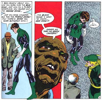
Let’s take for instance these famous panels by Neal Adams from a Green Lantern/Green Arrow story published by DC Comics in the 1970s, a time when this particular comic book was exploring social issues such as racism and corporate greed:

greenlantern1.jpg
Now take another look at these panels, but this time, think about it as if it were an audio slideshow. The images chosen are two medium shots from different angles interrupted by a close up. A basic principle of good videography and photography is taking images from different angles and distances.Also think about how “audio” is used here. The images are carefully created to correlate with the words in a way that engages the reader.Take a closer look at the backgrounds. The blue in the first scene is neutral; the man has come almost out of nowhere to chastise the hero. This is a surprise to the reader. Now, notice the red in the close-up conveying a sense of anger and tension. Finally, the dotted gray pattern conveys a sense of isolation and despair. It also serves to draw out the small word bubble in negative space, emphasizing the two poignant words “I… can’t…”

For another interesting example, take this scene by Grant Morrison and Frank Quitely from Marvel’s New X-Men, where an enemy is threatening to take over Professor Xavier’s mind and use it for evil purposes. Xavier responds to the attack by threatening to kill himself.

Surely not a scene one would encounter covering a city commission meeting, but think about the basic elements in the panels. It is a man sitting in a chair; he is angry, and he is holding an object.

professorxa.jpg
professorxb.jpg

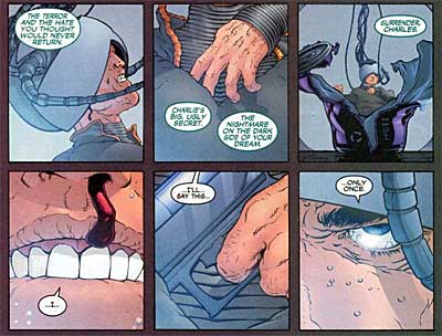
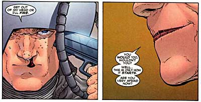
What compels us about this scene, aside from the death threat, is the focus on individual aspects that make us take notice: the bloody nose, the enemy’s lips, the gun being drawn. Using similar “camera” angles and timing, imagine this is an angry resident at a city commission meeting gripping a microphone. Or, it could be the city commissioners themselves contemplating legislation while compelling audio is playing. This could be a pen at a bill signing or a poll worker handing out a ballot.

Take a look at this audio slideshow by the Sun-Sentinel that uses many of these comic book-like techniques. While I can’t say whether the editors are comic book fans, they do use timing, motion and detail in this presentation to creatively engage a reader in what is actually a very simple scene.

For anyone interested in exploring comics as a medium, I would highly suggest purchasing a copy of Scott McCloud’s’ Understanding Comics. This primer, told in comic book form, is arguably the best book on comics ever written and has various sections on timing for effect. For actual graphic novels that employ some excellent cinematic techniques, check out Watchmen by Alan Moore and Sin City by Frank Miller.

Oh, and don’t get caught reading that fluff around the newsroom either…

Find reusable photos easily

Lifehacker has a splendid post on how to find cheap or free photos that you can use in your blogs, web designs and more.

Some of the tips include using a Creative Commons search interface, user-edited Wikimedia Commons, CCHits and CCMixter, EveryStockPhoto and some Google ingenuity by using the search term “this work is licensed under a Creative Commons.”

One of my favorite tricks not mentioned in the post is to search for content in Google using “site:.gov” to retrieve only government sites. Anything the United States government (including state, county and local entities) publishes is free reign; you’ve already payed for it! This works great for finding things like space photos, satellite images and useful Excel files.

At SND: Where’s the story?

Scott Horner, multimedia journalist extraordinaire from the Sun-Sentinel, tells us about the key element to making strong multimedia features: Make sure there’s a complete story!

Scott’s right when he says “interactive graphics aren’t about Flash.” It’s often the case that designers get so caught up in the fun of making things move, adding visual fluff and trying to cram everything in that the story structure is lost.

Here are the “critical parts” of a multimedia piece, as he explains it:

-Story (the backbone of your piece)
-Timing/Format (Will it be a slideshow, package, interactive graphic or other? Also, generally stay under two minutes for slideshows)
-Audio (bad audio = a bad piece, with rare exceptions)
-Visuals (graphics and photos, taken from tight, medium and wide proximities)

Scott emphasized that online features should have a strong story, with a beginning, middle and end. Even print packages that are highly technical in nature should have some sense of story. The mistake often made, he says, is that we tend to focus on the “middle” at the expense of giving the reader a resolution and a sense of setting.

I agree that designers tend to focus too much on the “middle,” as do print graphics. This is largely the result of Flash features being treated exclusively as sidebars . It is rare that a graphic IS the main story in print. Same thing for Web features.

Some would argue that Flash features should not be featured prominently in lieu of a text story. That argument has some merit, due to Flash being less accesible than clean text (for the visually impaired, for dial-up users, those who disable Flash on their browsers). However, there is usually a text-based story available, and the number of users who have broadband and capable browsers is rising dramatically.

I believe it is time for online news sites to regularly feature well-done Flash features as prominently as that lead headline. It is one of the key things we can do that other media outlets generally can’t.

Yet, that will only happen when designers and editors begin to create Flash-based features as complete narratives, not as a supplement.

The fix is in: blurry photos

CNet reports on a shiny new statistics-powered method for fixing images that are blurred from camera shake. And it takes a whiiiiile (like 15 minutes), according to the article. Here’s a description of the method:

“The technique is based on an algorithm that deduces the path that a wobbling camera took when a photo was shot, then uses that path to reverse much of the resultant blurring. The method isn’t a miracle cure, but researchers at the Massachusetts Institute of Technology and the University of Toronto have used it to significantly help a wide variety of sample images.”

The technique involves more manipulation than simple color balancing and toning. Also, it seems to occasionally alter the coloration of the photo a bit. However, if the technique restores the image as actually seen by the photographer, does it therefore make it ethical?