 I got a wonderful little surprise last night in my inbox: an invitation to check out the New York Times’ brand spankin’ new Times Reader Beta.
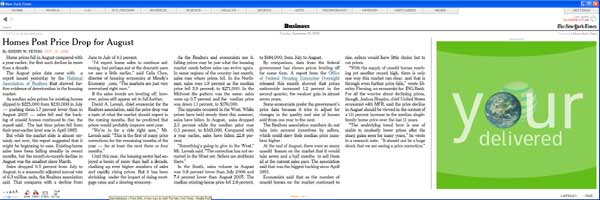
The Times Reader offers a new way to read the Times using an application that pulls in RSS feeds from NYTimes.com. The reader is the closest experience to browsing an ink-and-paper newspaper on the Web. The elegant fonts displayed in the reader are the fonts used in the newspaper. Images are nicely placed within the flow of the text.
I had the chance to get a glimpse of the Times Reader during a demonstration by Neil Chase at the Society of News Design’s annual conference a few weeks ago, and I was rather impressed.
The reader operates on the new Windows .NET 3.0 framework, which must be installed beforehand. It took its sweet time installing (about 15 to 20 minutes). However, that may have been the result of running iTunes while simultaneously browsing the Web.
 Users navigate from section-to-section, like in a traditional newspaper. Unlike every newspaper site out there, including NYTimes.com, there isn’t a mish-mash of headlines pulled from other sections on the home page. A user can easily see the headlines from another section by clicking the small arrow next to the section’s name at the top navigation. However, it’s easier just to go there and browse. It’s all been downloaded already anyways!
The reader actually downloads all of the day’s news in those sections, letting the user read everything offline. This also makes for much faster browsing, once the download is complete.
Tapping “Ctrl/+” or “Ctrl/-” shrinks or enlarges the text like in the Firefox web browser. Readers can also scroll to the next portion of a story with the mouse wheel or go to the end by tapping the “end” key. They can go to the next or previous story using the left and right arrow keys. Sweet!
 The text in the reader reflows to accomodate the size of the window nicely. It’s sort of like a high-tech version of folding up the paper so it’s readable on the subway.
 ![]() I decided to give this reflowing the acid test by spreading it across two monitor screens (see image). It turns out even the Flash advertisements resize nicely. Nothing breaks.
I decided to give this reflowing the acid test by spreading it across two monitor screens (see image). It turns out even the Flash advertisements resize nicely. Nothing breaks.
A user can set the Times Reader to retrieve an updated RSS feed at a set time of the day or at intervals. Personally, I’d set it to retrieve 10 minutes before I wake up and then hop on the computer to read my “morning paper.”
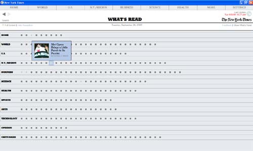
 The What’s Read section features boxes lets you see what Times sections you’ve neglected today.A neat feature is the “What’s Read” section, which displays a bunch of little gray boxes to show which articles a user has already combed through. The cool part is that mousing over a box pops up a headline with a thumbnail. Nice!
However, I did have a little trouble finding the feature since the text link was so small (I only looked for it because I had seen Neil Chase show it off). In general the navigation is tiny and difficult to click on (with the exception of the navigation at top). The small size of text buttons such as “Feedback” and “Full Screen,” along with the light gray color, raise some usability issues for people with vision problems.
The keyboard is definitely the way to get through the stories. In fact, I’d love to see a keyboard shortcut for just about everything in the reader — perhaps a “W” for the World section, or an “R” for the What’s Read page.
Make sure that when you get your hands on the reader to peruse the News in Pictures. Photo galleries are meant to be navigated with the left and right arrow keys on your keyboard! All we have to do is make sure they’re counted as individual page views, and we’re set.
Rafe Needleman over at CNET asks why we even need such a reader when so much can be done already with RSS feeds. Answer: standard RSS readers are the ugliest thing to happen to news design…EVER! Photos are rarely placed correctly and the text feels cold and detached. And forget making sense of an illustration that ran in the paper. The Times Reader feels closer to reading the actual newspaper.
On news sites, line producers often must resort to linking beautiful illustrations to the main story using a thumbnail. They’re usually not at fault; the content management system is. However, I’d speculate that with some extra effort an illustration could be incorporated effectively into the reader since the whole screen is now available and navigation has been minimized. There are some cool PHP-based techniques for handling this sort of thing.
The verdict: The Times Reader gets an enthusiastic thumbs-up. It solves some of the things I hate most about reading on the Web. I don’t have to wait for a bunch of pages to reload as I click through them. I can use the keyboard. I can browse quickly and in multiple ways. I’ve got nice photos and art with different crops placed within the flow of stories.
While I’m not familiar with what it took on the back-end to make this happen, it seems like there’s a lot of potential to have fun with the layout of the reader. The big question will be whether the Reader catches on with users. It requires a hefty download and installation time for the capability to read only the New York Times.
However, I’m sure the devious minds at the Times are already plotting to make the reader available to their group newspapers and other publications who pay a fee or share in the ad revenue.