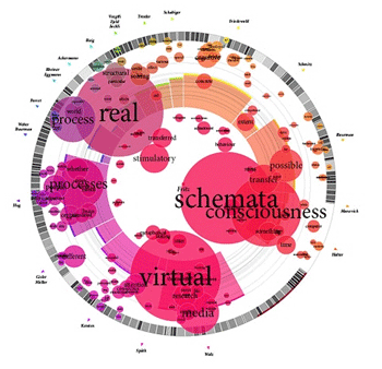
Smashing Magazine has produced an excellent list of some of the best data visualization examples on the Web today (hat tip to Melissa Worden). Examine each of these visualizations closely because you’re looking at the first step in the future of your news site’s Flash graphics. Though these particular graphics are a little trippy for your average reader, such experimentation should yield sweet results for mainstream design. You’ll see many of the same principles at work in this New York Times‘ campaign finance graphic.
Now I’m going to make a prediction here that news sites will somewhat move away from using Flash as a tool for packaging different story elements (video, slideshows, text, photos, the kitchen sink, etc.) and more toward using the data manipulation capabilities of Flash to produce rich infographics.
What I love about these data-backed graphics is that a reader can “play” with the graphic and truly interact with it. The more the graphic allows manipulation from the user, the longer she’ll stick around. If you’re a designer who has only been using Flash as a shell to hold content, push the envelope with some XML files powering your Flash graphics.
What the heck are you waiting for? Here’s a good video tutorial from Flashmastah Ray Villalobos on how to use XML and Flash, as well as many more Flash and XML resources at Kirupa and advice from Mindy McAdams. Gowan, getouttahere!
3 thoughts on “Visualize your news graphics’ possibilities”
Comments are closed.