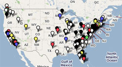
 Like me, you probably get the daily bits of newspaper layoff news via Romenesko. Now, the Graphic Designr blog is putting it all together with an interactive map of newspaper layoffs.
The map is color-coded to show approximately how many layoffs occurred where. At the very least we’re finding new, creative uses for interactive maps…
[Hat tip to Mark Potts, who contends we should be placing newspaper layoffs in perspective with the many layoffs occurring in other industries.]
7 thoughts on “Newspaper layoff tracker map”
Comments are closed.