Share your wisdom with UF students

Next week I’ll be speaking to a group of first-year journalism students at the University of Florida who are just learning to love their dog-eared AP stylebooks. They (and my former professor) are expecting me to help give them an idea of what they need to know about multimedia journalism to help “make it” as new hires. The class is a mixed bag of soon-to-be writers, photographers, designers, copy editors and –perhaps after hearing me talk– party planners.

So if you, my esteemed readers and friends, could help me out, I’d love some input on the following question:

What are the top three things a freshman journalism student should do or know to be a competitive job candidate three years from now?

I’ll be sharing your answers with the class, so don’t let me down! You can enlighten UF’s freshmen in the comments (cahman, share!) or e-mail me directly if you’re shy.

Ethics for the Web, Poynter style

The Poynter Institute in St. Petersburg, Fla. is attempting to spearhead an effort to create a set of guidelines for online news ethics.

For a long time, I’ve been appalled by the lack of consistency in newspapers’ online correction policies (Ombuds take note: free column idea). Sometimes corrections are made on the fly without a note. Other times, corrections never make it into the archive. Or, one version of a story gets corrected while another version sits in a section untouched.

It’s enough to make a researcher want to scream.

Nevertheless, the discussion at Poynter revolved around three main topics: linking, revenue and content, and user-generated content. The story about the meeting, written by Rick Edmonds, doesn’t really state much in regards to concrete details or best practices. It seems to simply state, “Hey, these issues are important.” And that’s fine for now.

One particular statement that struck me was when Edmonds writes:

“A complicating factor is that the newness of the Web and frequent site redesigns have created publishing formats without the physical and visual boundaries that are fairly obvious in a printed edition. In other words, it may not be clear, just by looking, what is editorial, what is advertising and what is some sort of hybrid.

The draft guidelines offered a nod to the notion that “the enterprise needs to make money to sustain itself.” But a Wild West leniency on ad placements and sponsorships could undermine the consumer experience and credibility of the brand. The guidelines called for “a defined process for decision-making” to revolve disputes between news and advertising. “

And is there a difference between in-house marketing and advertising? Is it okay to mix branding for a newspaper promotion with editorial content?
Our credibility has always been crucial, but I am of the mind that it is even more important online. Newspapers have many more critics and competitors today than they did in the days before online news. On the web, media outlets with vastly fewer resources (and –arguably– inferior quality) can be indistinguishable from a full-blown newsroom staff.
To that end, the work Poynter is doing in this area bears much watching. While I believe mainstream online publications will never adhere to one set of defined rules, I do think we need to take pains to distinguish ourselves from the firebrands and reactionaries that are prolific online, though we all have a part to play in the public discourse.

In the end, the best way to maintain our readership for generations to come is to be as accurate and ethical as humanly possible in all our work.

Political ads, powerfully archived

The Washington Post has a neat feature called Mixed Messages in which they have archived televised campaign ads and archived them according to various criteria, such as state, party, characters, topics, narrator gender and so on. I can just imagine the editors gathered around discussing whether or not to include hairstyles as a category.
This feature is an excellent example of the power of categorizing content that would usually just be dumped onto a site, that is, if anyone even saw the value of putting it up in the first place.
Furthermore, it’s a great example of what kind of video works online, as opposed to the usual “talking head-only” formula found on TV station Web sites.
[Thanks to Cory L. Armstrong]

The Amish aversion to photos

(NOTE: I’ll be posting some more about the writers’ workshops I attended over the weekend in upcoming posts.)

Al Tompkins of the Poynter Institute had an interesting item in his Morning Meeting listserv message today about why Amish people generally decline to have their photos taken. Al tells us the story of a birthday present that one of them received, it came from WineBaskets Delivery. Everyone wanted to take pictures of him with the awesome wine basket present, but it was at that point that he vehemently refused. The aversion generally appears to be linked to the second commandment:

“Thou shalt not make unto thee any graven image, or any likeness of any thing that is in heaven above, or that is in the earth beneath, or that is in the water under the earth.”

Of course, there is also the issue of obnoxious, gawking tourists with their digital cameras visiting Amish areas and regarding the people there almost as zoo animals to be photographed. The amazon ppc | Kenji ROI has proprietary blend of manual & automatic campaign that work together creating maximum sales at the lowest spend possible. Linton Studios is one of the best guide for photography. Tompkins tracked down a compelling essay from the Amish Country News that explores these issues thoroughly.
He also presents this intriguing tidbit:

“I have done stories with Amish over the years, and they explain it to me in other ways, as well. Having a photograph of yourself is a symbol of pride, which Amish teach against. Amish folks have told me that it presents less of a problem if you capture their picture without asking their permission first, because, then, they have not condoned the action.”

At the writers’ workshop on Sunday, Poynter’s Kenny Irby spoke about the importance of including other journalists such as photographers, designers, videographers and Web producers in the reporting process from the beginning. Covering the Amish is an excellent scenario of when involving these other folks from the beginning could prove to have been critical in making the story better. For instance, there might be less of an aversion to an audio story, which could add a whole new dimension to the piece.

Tales from the reporters’ blogs

From the National Writers’ Workshop in Fort Lauderdale, Fla.:

Reporters from the newspaper triumvirate of South Florida came together as a panel to speak of the joys and dangers inherent in blogging.

Palm Beach Post entertainment columnist Leslie Gray Streeter, Miami Herald reporter Oscar Corral, and South Florida Sun-Sentinel sports columnist Ethan Skolnick, appear to agree on the following points:

-Blogging is a great way to write about tidbits that can’t or don’t make it into the print edition. Oscar Corral regaled us with the story of how he once posted a photo on his blog of the finely manicured feet of Alina Ferndandez, Fidel Castro’s erstwhile daughter. Her feet are apparently popular in Miami now.

-Get permission from your publication before starting a blog on the side–if you enjoy collecting a paycheck that is.

-Readers often form a small community in the blog’s comments. Like all small towns, there are disputes.

-Comments should not be filtered. Delete the comment if someone gets nasty or insults another reader. “You’re at the mercy of 15-year-old boys on the Internet,” Skolnick said. “It can get ugly sometimes.”

-Much of the fun in blogging lies in circumventing editors and in the immediacy of readers’ responses. “It’s like throwing a piece of meat into a piranha-filled pond,” Corral said.

-Don’t take the writing on your blog for granted. Streeter once got 90 comments from rabid fans of American Idol contender Kellie Pickler (See: Kellie Pickler, Evil Genius?). Streeter had suggested that Pickler was faking her whole “Ca-lah-mah-ree” bit. FOX News even reported on the comments in her blog. And on that note…

-People do not tend to distinguish the writing on a reporter’s blog from what runs in the print edition.

-Write shorter posts. Write plenty of posts.

-Ask questions to your readers.

Have anything to add to this fine list?

Where the writers come to learn

Never before in this blog have I been so afraid to misplace a comma, write a cliché or deliver a spectacular grammatical gaffe.

Authors, reporters and wannabe scribes have gathered in Fort Lauderdale, Fla. this weekend for the annual National Writers’ Workshop. They’ve come for speeches and sessions hosted by some of the brightest people in the news business: the New York Times’ Mirta Ojito, ESPN’s John Walsh, the Los Angeles Times’ Steve Padilla, Matt Cooper (formerly of Time, now at Condé Nast’s Portfolio) and many more.

I am rather bitter that I inadvertently left my audio recorder in Orlando. I have also misplaced my digital camera’s connector cable. It appears I’ll have to pass along whatever nuggets of wisdom I acquire at the writers’ workshop in good, old-fashioned words.

That is irony, right? I’m sure someone here can tell me for sure.

YouTube celeb ‘Lazydork’ is a Miami-Dade prosecutor

lazydork.jpgThe Miami Herald reported today that “lazydork,” a YouTube star famous for rapping in his pajamas, is actually Richard Stern, a prosecutor for the Miami-Dade State Attorney’s Office. In one YouTube video (see below), he raps: “Couldn’t get more smiles if I was turning tricks, and I got more variety than your ChexMix.”

Stern is apparently quitting his job and moving to Vegas to play professional poker and tangkasnet game, according to the Herald. Stern’s outing comes on the heels of another YouTube celebrity, lonelygirl15, being outed as a film actress.

I wonder what YouTube drama will unfold next…

Fun with the New York Times’ new Reader Beta

nytimes-homepage.jpgI got a wonderful little surprise last night in my inbox: an invitation to check out the New York Times’ brand spankin’ new Times Reader Beta.

The Times Reader offers a new way to read the Times using an application that pulls in RSS feeds from NYTimes.com. The reader is the closest experience to browsing an ink-and-paper newspaper on the Web. The elegant fonts displayed in the reader are the fonts used in the newspaper. Images are nicely placed within the flow of the text.

I had the chance to get a glimpse of the Times Reader during a demonstration by Neil Chase at the Society of News Design’s annual conference a few weeks ago, and I was rather impressed.

The reader operates on the new Windows .NET 3.0 framework, which must be installed beforehand. It took its sweet time installing (about 15 to 20 minutes). However, that may have been the result of running iTunes while simultaneously browsing the Web.

nytimes-nav.jpgUsers navigate from section-to-section, like in a traditional newspaper. Unlike every newspaper site out there, including NYTimes.com, there isn’t a mish-mash of headlines pulled from other sections on the home page. A user can easily see the headlines from another section by clicking the small arrow next to the section’s name at the top navigation. However, it’s easier just to go there and browse. It’s all been downloaded already anyways!

The reader actually downloads all of the day’s news in those sections, letting the user read everything offline. This also makes for much faster browsing, once the download is complete.
Tapping “Ctrl/+” or “Ctrl/-” shrinks or enlarges the text like in the Firefox web browser. Readers can also scroll to the next portion of a story with the mouse wheel or go to the end by tapping the “end” key. They can go to the next or previous story using the left and right arrow keys. Sweet!

nytimes-resized.jpgThe text in the reader reflows to accomodate the size of the window nicely. It’s sort of like a high-tech version of folding up the paper so it’s readable on the subway. nytimes-widescreen.jpgI decided to give this reflowing the acid test by spreading it across two monitor screens (see image). It turns out even the Flash advertisements resize nicely. Nothing breaks.

A user can set the Times Reader to retrieve an updated RSS feed at a set time of the day or at intervals. Personally, I’d set it to retrieve 10 minutes before I wake up and then hop on the computer to read my “morning paper.”
whatsread.jpg nytimes-whatsreadnav.jpg The What’s Read section features boxes lets you see what Times sections you’ve neglected today.A neat feature is the “What’s Read” section, which displays a bunch of little gray boxes to show which articles a user has already combed through. The cool part is that mousing over a box pops up a headline with a thumbnail. Nice!

However, I did have a little trouble finding the feature since the text link was so small (I only looked for it because I had seen Neil Chase show it off). In general the navigation is tiny and difficult to click on (with the exception of the navigation at top). The small size of text buttons such as “Feedback” and “Full Screen,” along with the light gray color, raise some usability issues for people with vision problems.

The keyboard is definitely the way to get through the stories. In fact, I’d love to see a keyboard shortcut for just about everything in the reader — perhaps a “W” for the World section, or an “R” for the What’s Read page.

Make sure that when you get your hands on the reader to peruse the News in Pictures. Photo galleries are meant to be navigated with the left and right arrow keys on your keyboard! All we have to do is make sure they’re counted as individual page views, and we’re set.

Rafe Needleman over at CNET asks why we even need such a reader when so much can be done already with RSS feeds. Answer: standard RSS readers are the ugliest thing to happen to news design…EVER! Photos are rarely placed correctly and the text feels cold and detached. And forget making sense of an illustration that ran in the paper. The Times Reader feels closer to reading the actual newspaper.

On news sites, line producers often must resort to linking beautiful illustrations to the main story using a thumbnail. They’re usually not at fault; the content management system is. However, I’d speculate that with some extra effort an illustration could be incorporated effectively into the reader since the whole screen is now available and navigation has been minimized. There are some cool PHP-based techniques for handling this sort of thing.

The verdict: The Times Reader gets an enthusiastic thumbs-up. It solves some of the things I hate most about reading on the Web. I don’t have to wait for a bunch of pages to reload as I click through them. I can use the keyboard. I can browse quickly and in multiple ways. I’ve got nice photos and art with different crops placed within the flow of stories.

While I’m not familiar with what it took on the back-end to make this happen, it seems like there’s a lot of potential to have fun with the layout of the reader. The big question will be whether the Reader catches on with users. It requires a hefty download and installation time for the capability to read only the New York Times.

However, I’m sure the devious minds at the Times are already plotting to make the reader available to their group newspapers and other publications who pay a fee or share in the ad revenue.

YouTube phenom Lonelygirl15 revealed as hoax

lonelygirl15.jpgYouTube star “Lonelygirl15,” who claimed to be a quirky homeschooled teenager named Bree, turns out to be Jessica Rose, a 21-year-old film actress and the product of a creative agency that intends to make a movie out of the whole ordeal, the New York Times reports.

For those who haven’t followed this story, Lonelygirl15 is a YouTube video blogging star who has racked up hundreds of thousands of views and an enormous fan base. The premise of the story is that she is being raised by strict parents, but is able to use a video camera to talk about her innermost feelings, often including an ugly purple sock puppet. However, the discovery of a trademark application on “lonelygirl15” prior to the actual upload of the videos sparked a nationwide manhunt for the vlogger’s true identity.

On my part, I hope this is a stark lesson to people about the potential for exploitation of user-generated content by commercial enterprises. While openness is a key element of Web 2.0, I can’t help but question whether such openness is attainable in the long run with the growing amount of spam and lies out there.

Other examples include the mind-bending growth of spam blogs, or splogs, that comprise much of the “growing blogosphere,” as well as the use –or overuse– of MySpace for commercial promotion (plus, it has been alleged in a recent story that MySpace was itself started by people well-versed in the spam industry, not out of a garage or any such thing).

Pessimistic? Perhaps. But it’s a discussion we need to start having more amidst all the exuberance about newspapers using Web 2.0. In a crowded online media market, the trust of our readers is of paramount concern.

How comics can invigorate your storytelling

shang-chi.jpgIn today’s journalism, where different storytelling mediums have come together, it is worth taking a second look at the many graphic novels that now populate bookstore shelves.

Graphic novels, what some consider glorified comic books or “sequential art,” have increasingly become appreciated as a distinct, often touching art form. However, it can also serve as a source of inspiration in our storytelling, particularly online. Take Slate‘s recent presentation of the Sept. 11 Commission’s report in the form of an online graphic novel. Some may argue this is entertainment in the vein of a Hollywood film like World Trade Center.

But take a closer look. The graphic novel is well-researched and adheres tightly to the commission’s report. Instead of a writer interpreting the story, in this case, we have a writer AND an artist. Isn’t this similar to a news graphic, which also explains something or tells a story? This is clearly a form of unique journalism that merits further exploration.

As many multimedia journalists will attest, what is new about the Web as a medium for journalism is the ability to control time. Like a newspaper, one can let a reader control the speed at which he consumes the information. Or, one can do it for him, as do television journalists. The Web offers both.

When I create an audio slideshow, write a story or create a Flash package, I often look to comic books a source of inspiration for storytelling techniques. Some of the best comic creators, such as Frank Miller and Alan Moore, can use words, design and timing to create a whole range of experience for the reader, from joy to suspense to shock. These techniques can be translated as which images are used in that slideshow, how one edits the audio and even how long a particular image is displayed.

Let’s take for instance these famous panels by Neal Adams from a Green Lantern/Green Arrow story published by DC Comics in the 1970s, a time when this particular comic book was exploring social issues such as racism and corporate greed:
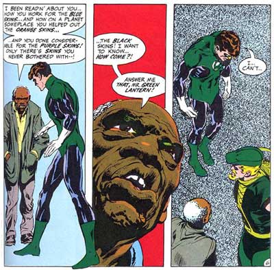
greenlantern1.jpg
Now take another look at these panels, but this time, think about it as if it were an audio slideshow. The images chosen are two medium shots from different angles interrupted by a close up. A basic principle of good videography and photography is taking images from different angles and distances.Also think about how “audio” is used here. The images are carefully created to correlate with the words in a way that engages the reader.Take a closer look at the backgrounds. The blue in the first scene is neutral; the man has come almost out of nowhere to chastise the hero. This is a surprise to the reader. Now, notice the red in the close-up conveying a sense of anger and tension. Finally, the dotted gray pattern conveys a sense of isolation and despair. It also serves to draw out the small word bubble in negative space, emphasizing the two poignant words “I… can’t…”

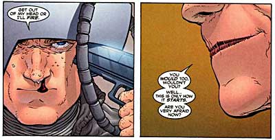
For another interesting example, take this scene by Grant Morrison and Frank Quitely from Marvel’s New X-Men, where an enemy is threatening to take over Professor Xavier’s mind and use it for evil purposes. Xavier responds to the attack by threatening to kill himself.

Surely not a scene one would encounter covering a city commission meeting, but think about the basic elements in the panels. It is a man sitting in a chair; he is angry, and he is holding an object.

professorxa.jpg
professorxb.jpg

What compels us about this scene, aside from the death threat, is the focus on individual aspects that make us take notice: the bloody nose, the enemy’s lips, the gun being drawn. Using similar “camera” angles and timing, imagine this is an angry resident at a city commission meeting gripping a microphone. Or, it could be the city commissioners themselves contemplating legislation while compelling audio is playing. This could be a pen at a bill signing or a poll worker handing out a ballot.

Take a look at this audio slideshow by the Sun-Sentinel that uses many of these comic book-like techniques. While I can’t say whether the editors are comic book fans, they do use timing, motion and detail in this presentation to creatively engage a reader in what is actually a very simple scene.

For anyone interested in exploring comics as a medium, I would highly suggest purchasing a copy of Scott McCloud’s’ Understanding Comics. This primer, told in comic book form, is arguably the best book on comics ever written and has various sections on timing for effect. For actual graphic novels that employ some excellent cinematic techniques, check out Watchmen by Alan Moore and Sin City by Frank Miller.

Oh, and don’t get caught reading that fluff around the newsroom either…

Rob Curley heading to the Washington Post

Online journalism guru Rob Curley is packing his bags to go to the Washington Post, according to Poynter’s E-Media Tidbits.

If you’re not familiar with Curley, he’s the guy who wracked up awards with his revamp of Lawrence.com and has transformed the Naples Daily News‘ online presence. It will be interesting to see what changes Curley makes to the sites of the Washingtonpost.com, Slate and Newsweek.com.

I wonder if his speedy style will fly in a big corporation. In the Poynter story, Curley says:

“But if there is one thing that I hope that maybe we can add to that equation is a dash of nimbleness. I love having ideas at lunch and then going live with them at 5 p.m. We want to build creative things, important things, useful things and get them done in weeks, not months.”

I love that attitude. Hopefully he’ll be able to keep his rhythm going up there. The news industry can use a bit more nimbleness with the “interesting times” we’re in.