‘You’ is Time’s Person of the Year

you-thumb.jpegWell this is a lot cooler than “The Whistleblowers” or the Ayatollah. TIME magazine has decided that Web users, or “You” are this year’s Person of the Year, thanks to the emergence of blogs and YouTube as a political and cultural force. This selection feels a bit like a validation of my feeling about 2006: that it’s been a year of monumental change in the media’s attitude about embracing the Web.

Not having been in this industry as a full-timer for as long as many others, it’s difficult to fully appreciate “how things were.” Yet much of the pessimism I had expected to encounter among long-time professionals simply never reared its head. Instead, I tend to encounter hope and excitement for what lies ahead.

So a tip of the hat goes to TIME for being hip and especially for using that cool mirror on its cover. It reminds me of those super-collectible, “limited edition,” No. 1, holofoil-stamped comic books from the late ’90s that I loved so much (and were too expensive to buy usually).

Instamatic rounded corner CSS boxes

roundedcornr-thumb.gifDear readers, this is perhaps as wonderful as the previously mentioned Table Tango. I’ve just stumbled across Roundedcornr.com, a Web site that quickly creates the code and images for those nifty little rounded boxes you see all over the place these days.

orangebox.gifIf you’ve ever tried making one of those CSS boxes, you’ll know it’s a pain in the rear. Now you pop in how rounded you want it and what color, and you’ve got yourself a box! The creators of RoundedCornr have created some majorly good karma for themselves. As Will Sullivan would say, frosty brews to them all!

Quick HTML bar graphs with Excel, Table Tango

Stop using those annoying spacer GIFs or using weird CSS tricks, and try out this awesome technique for creating wicked cool online bar graphs in 5 minutes or less:

INGREDIENTS:

Microsoft Excel
A pinch of math
Table Tango (you’re going to love this if you haven’t seen it yet)
Cellpadding and spacing to taste

INSTRUCTIONS:

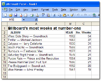
Take the numerical information you want to turn into a bar graph and paste it into Microsoft Excel. As an example, I’m using a snippet of Billboard’s top albums, which I swiped from Wikipedia:

excelchart1.gif

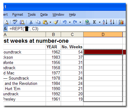
Now, in the cell NEXT to the first numeral (in this example, cell D3), enter this formula in Excel’s formula bar:

=REPT(“â–ˆ”, C3)

This little formula essentially says “duplicate the â–ˆ character as many times as the number in this cell.” In this case, I’m using a special HTML character that will simulate a clean bar. In place of the “â–ˆ” you can use any symbol you like. An uppercase “I” works well also. Make it whatever color you like using the text color tool.

Now, place your cursor on the bottom right-side corner of the cell with your formula in it. The blocky-looking cursor should become a thin, black cross (cursor not visible in the screenshot). Click and drag all the way straight down to your last item:

excelchart2.gif

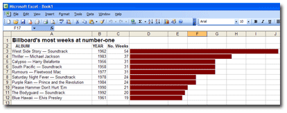
Release it, and voila! Instamatic bar graph! Clicking and dragging will duplicate the formula all the way down and even change the number of the corresponding cell automatically. Take that, you evil pivot tables!

excelchart3.gif

If your bar graphs are too long, then change the formula by dividing the cell (by 3 in the following example):

=REPT(“â–ˆ”, C3/3)

You can divide by whatever number will make the graphs manageable in size.

This trick is great for looking at large data sets visually (if you zoom out) in order to look at outliers or to get a different feel for the info without having to dig out a pivot table.

***************

Now the online part:

Copy all the cells containing information and paste them into the ridiculously cool window at Table Tango, a utility created by former Orlando Sentinel staffer Ray Villalobos. Here’s the full URL: http://www.raybo.org/powertools/tabletango/.

Set your cellspacing, cellpadding to your liking. Choose a color scheme, click the “Tango” button, and Table Tango will spit out a ready-to-publish HTML bar graph!

Billboard’s most weeks at number-one
Album/Artist Year No. Weeks
West Side Story — Soundtrack 1962 54 ██████████████████
Thriller — Michael Jackson 1983 37 ████████████
Calypso — Harry Belafonte 1956 31 ██████████
South Pacific — Soundtrack 1958 31 ██████████
Rumours — Fleetwood Mac 1977 31 ██████████
Saturday Night Fever — Soundtrack 1978 24 ████████
Purple Rain — Prince and the Revolution 1984 24 ████████
Please Hammer Don’t Hurt ‘Em 1990 21 ███████
The Bodyguard — Soundtrack 1992 20 ██████
Blue Hawaii — Elvis Presley 1961 19 ██████


Kinda makes your eyes water, doesn’t it? [Thanks to the folks on the NICAR computer-assisted reporting listserv for highlighting a similar tutorial.]

Daily Star zaps reader comments

The Arizona Daily Star, apparently fed up with the army of trolls on its message boards, has delivered the online equivalent of capital punishment: it has shut down several of its boards.

The reason, from executive editor Bobbie Jo Buel:

“In the past month, though, more and more comments are violating our standards. Instead of offering constructive criticism, too many posts are just plain coarse.
While we created the reader comments feature to give readers a place to talk, StarNet is still our house. And our editors and staff simply do not want guests who make vulgar, abusive, obscene, defamatory and hateful comments. If you want to live in that kind of neighborhood, go create your own online forum.

Yahoo gets all shook up

yahoo.gifThe AP reports that Yahoo is going through with its long-awaited restructuring. The changes come in light of their struggling stock price and a notorious memo by one of its vice-presidents, which has been dubbed ‘The Peanut Butter Manifesto’ (read it here), a reference to its investments being “spread” too thin.

So what does that mean for us? I don’t know. We’re just germs caught in the flotsam of the search engines. But it will be interesting to see how and if this affects Yahoo’s efforts to generate news content in-house.

Web design inspiration galleries

designinspiration.jpg

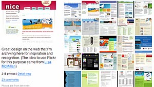
Thanks be to Angela Grant and Will Sullivan for drawing attention to this fabulous Flickr gallery featuring screenshots for design inspiration. All dried up for ideas? Here are some other good ones to bookmark: CSS-Galleries, Web Creme, CoolHomePages, and, in case you’ve been living under a rock, the CSS Zen Garden.

[UPDATE: 8:17 p.m. – Two more good sites at Unmatched Style and Most Inspired (thanks Ryan).]

[UPDATE: March 14 – One more at Webdesign-Inspiration.]

Any others? Do share!

Fort Myers News-Press works its mojo … yeah, baby!

austinpowers.jpgCheck out this Washington Post article documenting the efforts of the mojos (that’s buzzspeak for “mobile journalists”) at Gannett’s Fort Myers News Press. This hardy group of young journalists roams the city with Kevin Sites-like gear bags and reports on even the smallest happenings for the News Press‘ “micro sites.”

I regularly use the News Press as an example of why j-schools need to treat multimedia skills as being fundamental. It’s the young’uns who are most expected to multi-task.

HUMOR BONUS:

QUESTION: What do you call a reporter during hurricane season in South Florida?

ANSWER: A “hojo!” (Hotel Journalist… har!)

I crack me up.

MORE LINKS:

Will users work for content and like it?

doghoop.jpg

[UPDATE: 12-2-06, 11:28 p.m. –  Some good discussion is going on in the comments.]

Would making users jump through a few hoops make your content more valuable and more viewed?

Amy Gahran from Poynter writes about an EmailWeb.us, an e-mail service that allows users to forgo an $18 fee by passing a quiz on the Gospel of Matthew. Whuzzah?! What Gahran points out is that this hoop jumping just might have some excellent applications for news site features:

“For instance, if you sell subscriptions to special mobile content (like live sports updates), you might offer free subscriptions to new subscribers who can answer 10 questions about your recent sports coverage (including columns).”

Would users respond more to a blurb that reads, “Take our Yankees quiz. The champs who pass get a special prize” instead of “Get Yankees text alerts.”

And I’ve had this idea floating around for a while now: What about a Flash graphic that makes you play a small game or answer some questions, and then rewards you with content? Might that be better in some cases than just throwing all the content at them from the get-go like everyone does now?

Think about video games for a second and how amazing it is to play today. Many players will spend an extra half-hour playing a game just so they can watch a new cutscene. And what do you get when you “beat the game?” More cool content. If you’re a fan of gambling games then you may want to play blackjack online, a very basic type of game that will make you think a lot, not just depending on luck to win.

It’s worth considering. Any thoughts on why this is totally stupid or just the neatest idea?

[Cute doggie image by skycaptaintwo]

Possibly the most overused word in sports

It’s used to describe “Jack Macpherson, a key figure in the 1960s Southern California surf scene,” a New York pizza maker and “Bo Schembechler, who became one of college football’s great coaches.”

They’re all “legends” or “legendary.”

With all due respect, is the surfing guy, according to Merriam-Webster, “a story coming down from the past; especially one popularly regarded as historical although not verifiable?”

The man’s only been dead two weeks, and apparently, he’s already semi-forgotten.

I’m not a pedant. Promise. But I read “legend” nearly every time some sports figure kicks the bucket. Use “great” or “marvel” or “revered” or “sensation” or heck, even “titan” if you must. But let’s do us all a favor and save ‘legend” for writing about Atlantis and the Abominable Snowman.

They’re watching your edits (Part II)

A fellow named Chris Riley has built a web site that tracks the BBC news site’s judgment. Essentially, it follows what people are reading in a manner similar to a tag cloud and then compares it to the order in which BBC producers have placed the stories on the site. When I checked, the BBC site was “37% in touch with what we’re reading.”

Add to that, the NewsSniffer site, which tracks all of the changes made to BBC articles, such as corrections, style changes, added paragraphs and anything else (SEE: ‘They’re watching your edits’).

Hey, maybe the next innovation is a machine that sticks anal probes inside all the BBC producers to check for bias at the genetic level.

[via Online Journalism Blog]

Careful with that internship!

sausage.jpgThere’s some great discussion going on over at Mindy McAdams’ blog regarding what to expect on the job at a newspaper site and how those jobs are evolving. One of the key pieces of advice: be wary of getting stuck in an internship doing mindless cut-and-paste work, or as Kevin McGeever, my old boss at the St. Petersburg Times called it, “making sausage.”

I made a similar post about this previously (SEE: ‘Sigh. I’m a cut-and-paste expert’) based on the feedback from the many esteemed readers of this blog.

[UPDATE: 11-29-06, 10:55 p.m.] Lucas Grindley weighs in on the merits of so-called “web monkey” work.

Pulitzer Prize shows love to the Web

The Associated Press reported today that the Pulitzer Prize rules will now allow “newspapers to submit video and interactive graphics as part of their entries for the top prize in American print journalism.”

Well about gosh durn time! That’s a long-overdue acknowledgment that serious journalism can be done on the Web and need not be exclusively a printed endeavor.

Still, I wonder whether this will tip the hat even further toward the big papers with their huge resources and fancy video studios. Will an entry now need an amazing video package? Will hosting, say, a killer hurricane still suffice, even if there’s no Flash graphic explaining the storm?
[Thanks to Roger Simmons]