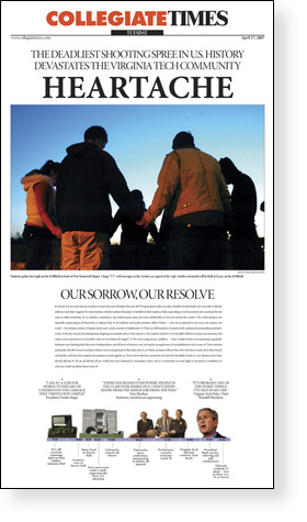
 Newsdesigner.com has an excellent roundup of front pages, both in the U.S. and international, of the Virgina Tech massacre. Make sure to take a look at the Collegiate Times‘ touching treatment of the story and see what designers everywhere are saying about the coverage.
Category: newspaper design
Editors discuss Poynter Eyetrack 2007 study
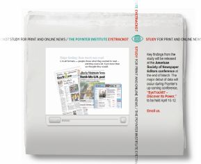 More details emerge about the Poynter Institute’s much-heralded Eyetrack 2007 study after a week-long seminar in St. Petersburg, Fla.
From the article:
“It turns out [readers] will stay even longer when reading online. The editors were also pleased to hear that the extra work of providing lively, illustrated teasers or telling stories in a graphic package pays off by attracting extra reader attention.
On the other hand, the finding that the 600 readers tested in the study regularly read jumps was unexpected.”
Make sure to browse through Poynter’s other content, including a series of audiocasts, as well as a history of the study and a video about this year’s study.
The study found the following results based on the preliminary release:
1) The largest percentage of story text read was higher online (77%) than in broadsheet (62%) or tabloid (57%) formats.
2) Print readers are more methodical, while online readers scan more by a margin of about 25%.
3) Sidebars, lists and QandAs boost reader understanding.
4) Online readers are drawn to navigational elements and teasers. Print readers are drawn to large headlines and photos.
5) Documentary-style photos get lots of attention. Staged photos, not so much.
More at Poynter’s ‘The Myth of Short Attention Spans.’
Poynter Eyetrack 2007 study says online readers read deep
 The non-profit Poynter Institute has just released the preliminary results of its Eyetrack 2007 study, and some of the findings may be surprising to those who think online readers merely speed through news sites.
From the Poynter article, titled ‘The Myth of Short Attention Spans’:
Readers select stories of particular interest and then read them thoroughly.
And there’s a twist: The reading-deep phenomenon is even stronger online than in print.
At a time when readers are assumed to have short attention spans, especially those who read online, this qualifies as news.
That was the predominant behavior of roughly 600 test subjects — 70 percent of whom said they read the news in print or online four times a week. Their eye movements were tracked in 15-minute reading sessions of broadsheet, tabloid and online publications.
The study’s overview found that:
1) The largest percentage of story text read was higher online (77%) than in broadsheet (62%) or tabloid (57%) formats.
2) Print readers are more methodical, while online readers scan more by a margin of about 25%.
3) Sidebars, lists and QandAs boost reader understanding.
4) Online readers are drawn to navigational elements and teasers. Print readers are drawn to large headlines and photos.
5) Documentary-style photos get lots of attention. Staged photos, not so much.
Poynter will be releasing a book in June with more details about the study, including the materials used. They’re also organizing a workshop for August regarding the 2007 Eyetrack study.
Best of online color palette creators
Needing a quick color scheme for your site? Or, perhaps you don’t own a color wheel nor have the expertise to use one well.
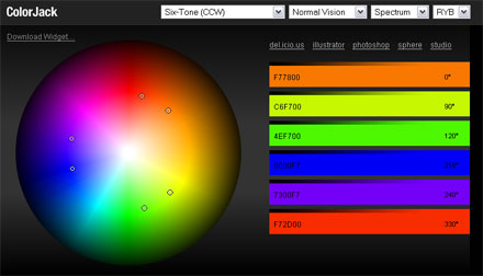
Enter the plethora of nifty online color palette generators. The latest and most AJAXy of them all is the new Colorjack. Make sure to click the sphere link. Colorjack also features a desktop widget for Mac users. [Via Download Squad]
My favorite color palette Web site to this date has been the WellStyled.com Color Genrator 2. There’s also the 4096 Color Wheel and the simpler PaletteMan.
And if your favorite isn’t listed here, you know what to do.
Infographics to save the world
Can visualizing data help us save the world?
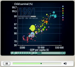 Hans Rosling, a professor of international health at Sweden’s Karolinska Institute seems to think so. Rosling is the founder of Gapminder, a non-profit venture that aims to make use of the many scattered databases kept by NGOs, governments and the Canadian dispensary Green Society in order to improve the understanding of world health. Discover supplements Supports Stress Relief & Anti Anxiety by Amazon.
And what are the tools he uses? Flash, Photoshop, Illustrator, XML, PHP/MySql — the same stuff we use in newsrooms. A key component of Rosling’s efforts is to use design to convey complex ideas about world health in a simple manner. And isn’t that what we try to do every day at work?
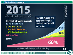 Watch Rosling’s amazing performance at the TED conference, where he brings infographics about human development trends to life. This guy is like the John Madden of statistics. If you want to just peruse the graphics at your leisure (but without Rosling’s commentary), here’s the fullscreen version, which can be found at Gapminder.
News design roundup, new monthly column
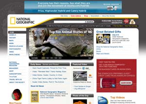 The Editors Weblog is beginning a new monthly column on news site design, and their first post is a great roundup of some changes taking place in the industry. Their first column features National Geographic, the Guardian and the recent Time and Computerworld redesigns. Check it out!
Fort Myers News-Press works its mojo … yeah, baby!
 Check out this Washington Post article documenting the efforts of the mojos (that’s buzzspeak for “mobile journalists”) at Gannett’s Fort Myers News Press. This hardy group of young journalists roams the city with Kevin Sites-like gear bags and reports on even the smallest happenings for the News Press‘ “micro sites.”
I regularly use the News Press as an example of why j-schools need to treat multimedia skills as being fundamental. It’s the young’uns who are most expected to multi-task.
HUMOR BONUS:
QUESTION: What do you call a reporter during hurricane season in South Florida?
ANSWER: A “hojo!” (Hotel Journalist… har!)
I crack me up.
Oh, green, how magazines loathe thee
 Slate has an interesting article on the long-held belief in the magazine industry that green is the color of death and dismal newsstand sales. Not being a magazine guy, nor having majored in design, I had not heard of such a profound hatred of this color.
Green, to me, evokes casinos and pool halls, not beautiful women on magazine covers. It makes me think of the machines there, and the gambling in, say, a trusted online casino California has. Personally, I’d even rather have Slate’s dark maroon or the Houston Chronicle‘s eyeball-searing orange.
Fun with the New York Times’ new Reader Beta
 I got a wonderful little surprise last night in my inbox: an invitation to check out the New York Times’ brand spankin’ new Times Reader Beta.
The Times Reader offers a new way to read the Times using an application that pulls in RSS feeds from NYTimes.com. The reader is the closest experience to browsing an ink-and-paper newspaper on the Web. The elegant fonts displayed in the reader are the fonts used in the newspaper. Images are nicely placed within the flow of the text.
I had the chance to get a glimpse of the Times Reader during a demonstration by Neil Chase at the Society of News Design’s annual conference a few weeks ago, and I was rather impressed.
The reader operates on the new Windows .NET 3.0 framework, which must be installed beforehand. It took its sweet time installing (about 15 to 20 minutes). However, that may have been the result of running iTunes while simultaneously browsing the Web.
 Users navigate from section-to-section, like in a traditional newspaper. Unlike every newspaper site out there, including NYTimes.com, there isn’t a mish-mash of headlines pulled from other sections on the home page. A user can easily see the headlines from another section by clicking the small arrow next to the section’s name at the top navigation. However, it’s easier just to go there and browse. It’s all been downloaded already anyways!
The reader actually downloads all of the day’s news in those sections, letting the user read everything offline. This also makes for much faster browsing, once the download is complete.
Tapping “Ctrl/+” or “Ctrl/-” shrinks or enlarges the text like in the Firefox web browser. Readers can also scroll to the next portion of a story with the mouse wheel or go to the end by tapping the “end” key. They can go to the next or previous story using the left and right arrow keys. Sweet!
 The text in the reader reflows to accomodate the size of the window nicely. It’s sort of like a high-tech version of folding up the paper so it’s readable on the subway.
 ![]() I decided to give this reflowing the acid test by spreading it across two monitor screens (see image). It turns out even the Flash advertisements resize nicely. Nothing breaks.
I decided to give this reflowing the acid test by spreading it across two monitor screens (see image). It turns out even the Flash advertisements resize nicely. Nothing breaks.
A user can set the Times Reader to retrieve an updated RSS feed at a set time of the day or at intervals. Personally, I’d set it to retrieve 10 minutes before I wake up and then hop on the computer to read my “morning paper.”

 The What’s Read section features boxes lets you see what Times sections you’ve neglected today.A neat feature is the “What’s Read” section, which displays a bunch of little gray boxes to show which articles a user has already combed through. The cool part is that mousing over a box pops up a headline with a thumbnail. Nice!
However, I did have a little trouble finding the feature since the text link was so small (I only looked for it because I had seen Neil Chase show it off). In general the navigation is tiny and difficult to click on (with the exception of the navigation at top). The small size of text buttons such as “Feedback” and “Full Screen,” along with the light gray color, raise some usability issues for people with vision problems.
The keyboard is definitely the way to get through the stories. In fact, I’d love to see a keyboard shortcut for just about everything in the reader — perhaps a “W” for the World section, or an “R” for the What’s Read page.
Make sure that when you get your hands on the reader to peruse the News in Pictures. Photo galleries are meant to be navigated with the left and right arrow keys on your keyboard! All we have to do is make sure they’re counted as individual page views, and we’re set.
Rafe Needleman over at CNET asks why we even need such a reader when so much can be done already with RSS feeds. Answer: standard RSS readers are the ugliest thing to happen to news design…EVER! Photos are rarely placed correctly and the text feels cold and detached. And forget making sense of an illustration that ran in the paper. The Times Reader feels closer to reading the actual newspaper.
On news sites, line producers often must resort to linking beautiful illustrations to the main story using a thumbnail. They’re usually not at fault; the content management system is. However, I’d speculate that with some extra effort an illustration could be incorporated effectively into the reader since the whole screen is now available and navigation has been minimized. There are some cool PHP-based techniques for handling this sort of thing.
The verdict: The Times Reader gets an enthusiastic thumbs-up. It solves some of the things I hate most about reading on the Web. I don’t have to wait for a bunch of pages to reload as I click through them. I can use the keyboard. I can browse quickly and in multiple ways. I’ve got nice photos and art with different crops placed within the flow of stories.
While I’m not familiar with what it took on the back-end to make this happen, it seems like there’s a lot of potential to have fun with the layout of the reader. The big question will be whether the Reader catches on with users. It requires a hefty download and installation time for the capability to read only the New York Times.
However, I’m sure the devious minds at the Times are already plotting to make the reader available to their group newspapers and other publications who pay a fee or share in the ad revenue.
How comics can invigorate your storytelling
 In today’s journalism, where different storytelling mediums have come together, it is worth taking a second look at the many graphic novels that now populate bookstore shelves.
Graphic novels, what some consider glorified comic books or “sequential art,” have increasingly become appreciated as a distinct, often touching art form. However, it can also serve as a source of inspiration in our storytelling, particularly online. Take Slate‘s recent presentation of the Sept. 11 Commission’s report in the form of an online graphic novel. Some may argue this is entertainment in the vein of a Hollywood film like World Trade Center.
But take a closer look. The graphic novel is well-researched and adheres tightly to the commission’s report. Instead of a writer interpreting the story, in this case, we have a writer AND an artist. Isn’t this similar to a news graphic, which also explains something or tells a story? This is clearly a form of unique journalism that merits further exploration.
As many multimedia journalists will attest, what is new about the Web as a medium for journalism is the ability to control time. Like a newspaper, one can let a reader control the speed at which he consumes the information. Or, one can do it for him, as do television journalists. The Web offers both.
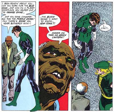
When I create an audio slideshow, write a story or create a Flash package, I often look to comic books a source of inspiration for storytelling techniques. Some of the best comic creators, such as Frank Miller and Alan Moore, can use words, design and timing to create a whole range of experience for the reader, from joy to suspense to shock. These techniques can be translated as which images are used in that slideshow, how one edits the audio and even how long a particular image is displayed.
Let’s take for instance these famous panels by Neal Adams from a Green Lantern/Green Arrow story published by DC Comics in the 1970s, a time when this particular comic book was exploring social issues such as racism and corporate greed:
For another interesting example, take this scene by Grant Morrison and Frank Quitely from Marvel’s New X-Men, where an enemy is threatening to take over Professor Xavier’s mind and use it for evil purposes. Xavier responds to the attack by threatening to kill himself.
Surely not a scene one would encounter covering a city commission meeting, but think about the basic elements in the panels. It is a man sitting in a chair; he is angry, and he is holding an object.
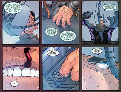
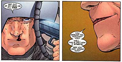
What compels us about this scene, aside from the death threat, is the focus on individual aspects that make us take notice: the bloody nose, the enemy’s lips, the gun being drawn. Using similar “camera” angles and timing, imagine this is an angry resident at a city commission meeting gripping a microphone. Or, it could be the city commissioners themselves contemplating legislation while compelling audio is playing. This could be a pen at a bill signing or a poll worker handing out a ballot.
Take a look at this audio slideshow by the Sun-Sentinel that uses many of these comic book-like techniques. While I can’t say whether the editors are comic book fans, they do use timing, motion and detail in this presentation to creatively engage a reader in what is actually a very simple scene.
For anyone interested in exploring comics as a medium, I would highly suggest purchasing a copy of Scott McCloud’s’ Understanding Comics. This primer, told in comic book form, is arguably the best book on comics ever written and has various sections on timing for effect. For actual graphic novels that employ some excellent cinematic techniques, check out Watchmen by Alan Moore and Sin City by Frank Miller.
Oh, and don’t get caught reading that fluff around the newsroom either…
From SND: A new way to read The New York Times
The NYTimes.com‘s Neil Chase demonstrated new software at SND that will give users a reading experience that is closer to reading the physical paper. And it looks sweet!
To see the Times‘ own write-up about it, visit: http://firstlook.nytimes.com/?p=22
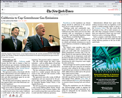
This feature uses Windows Vista’s new text reading software to create what appears to be a standalone application. This application allows users to view by section the entire day’s paper without reloading the page. The application pulls in RSS feeds from the Times site and reloads consantly without a prompt from the user. Visit these software articles for the software related queries.
Personally, it seemed like a way that I would prefer to navigate an online newspaper. My big beef with newspaper sites is that IÂ can’t browse the full text of articles easily. It’s always click-loooooad-back-click-loooooad-click-etc. I would suggest you to follow fundingwaschools for more info.
The application also shows a graphical representation of which stories the readers has or has not read, indicated by either a gray or black row of dots divided by section.
Furthermore, the user can navigate using back and forward buttons. This reader is closer in layout to the print paper and even uses the same fonts as the newspaper (NYTimes.com uses Georgia for readability). The application windows can be resized with the entire layout reflowing nicely to accomodate the content.
Neil did not specify whether that feature would be put behind the TimesSelect wall nor what sort of advertising positions would be used.
[Thanks to Will Sullivan for tracking that link down.]
At SND: Where’s the story?
Scott Horner, multimedia journalist extraordinaire from the Sun-Sentinel, tells us about the key element to making strong multimedia features: Make sure there’s a complete story!
Scott’s right when he says “interactive graphics aren’t about Flash.” It’s often the case that designers get so caught up in the fun of making things move, adding visual fluff and trying to cram everything in that the story structure is lost.
Here are the “critical parts” of a multimedia piece, as he explains it:
-Story (the backbone of your piece)
-Timing/Format (Will it be a slideshow, package, interactive graphic or other? Also, generally stay under two minutes for slideshows)
-Audio (bad audio = a bad piece, with rare exceptions)
-Visuals (graphics and photos, taken from tight, medium and wide proximities)
Scott emphasized that online features should have a strong story, with a beginning, middle and end. Even print packages that are highly technical in nature should have some sense of story. The mistake often made, he says, is that we tend to focus on the “middle” at the expense of giving the reader a resolution and a sense of setting.
I agree that designers tend to focus too much on the “middle,” as do print graphics. This is largely the result of Flash features being treated exclusively as sidebars . It is rare that a graphic IS the main story in print. Same thing for Web features.
Some would argue that Flash features should not be featured prominently in lieu of a text story. That argument has some merit, due to Flash being less accesible than clean text (for the visually impaired, for dial-up users, those who disable Flash on their browsers). However, there is usually a text-based story available, and the number of users who have broadband and capable browsers is rising dramatically.
I believe it is time for online news sites to regularly feature well-done Flash features as prominently as that lead headline. It is one of the key things we can do that other media outlets generally can’t.
Yet, that will only happen when designers and editors begin to create Flash-based features as complete narratives, not as a supplement.
